Doors at 8 App Development
A walkthrough of my mobile designs for a local ticketing platform.
PROCESS HIGHLIGHTS
Design Overview
Challenge
Design a ticketing app that elevates social interactions between eventgoers and increases hyper-localized event promotion.
Opportunity
Redefine the ticket-buying experience for event-goers by making it seamless and empowering.
Timeline
3/3/2025 - 3/19/2025
16 Days
Role
Lead UX Designer
UX Researcher
Responsibility
UX Research
UX/UI Mobile Design
Prototyping
Tools
Figma
Slack
BACKGROUND
The Why
Doors at 8 is more than just a project, it's a response to a real, everyday frustration many of us face when trying to discover and attend local events. Whether overpriced tickets, hidden fees, or a lack of visibility for smaller venues, the current ticketing experience often feels impersonal and inaccessible. At its core, Doors at 8 is about restoring connection and trust in the live event space.
The Process
1
Research
Identifying Problems
Competitor Analysis
User Interviews
2
Synthesis
Affinity Mapping
User Persona
Task Flow
3
Ideation
Sketching
Low-Fidelity
Mid-Fidelity
4
Design
High-Fidelity
5
Reflection
Conclusion
RESEARCH
Initial Problem Discovery
The main problem I aimed to address is the fragmented and impersonal experience of discovering and purchasing tickets for local events. While platforms like Ticketmaster, AXS, and StubHub offer wide access to major events, they often come with poor transparency and little attention to local venues.
While social media, city calendars, and venue websites all provide pieces of the puzzle, but there's no cohesive way to browse, plan, and attend local events in one place.
This project seeks to rethink what ticketing can look like when centered around locality, transparency, and connection. My goal is to design a platform that not only makes event discovery and purchasing easier, but also restores trust, supports artists and venues.
RESEARCH
Competitor Analysis

Ticketmaster
Pros
Large Event Selection: Offers access to high-demand concerts, sports, and live events.
Market Reach: Deeply embedded into venue contracts, ensuring ticket availability.
Cons
High Fees: 30–50% markup on tickets with service and processing charges.
Poor UX: Frustrating checkout experience.
No Community Features: No support for engagement or discovery beyond transactions

AXS
Pros
Verified Resale: Offers markup-regulated resale to curb scalping.
Some Artist Control: Allows more artist control over ticketing than Ticketmaster.
Cons
Corporate Driven: Local partnerships exist but feel impersonal.
Lacks Discovery Features: Primarily focused on sports and concerts, not new or local events.
No Community Tools: No user-driven engagement features.

Stubhub
Pros
Resale Convenience: Enables easy access to sold-out events via high-volume resellers.
Cons
High Resale Fees: 10–25% added costs.
Poor UX: Cluttered interface prioritizing resale over discovery.
Lack of Transparency: True fees only visible at final checkout.
No Artist or Local Support: No control for creators or support for local event promotion.
No Community Features: Purely transactional platform.

Eventbrite
Pros
Low Fees: Transparent pricing; lower fees depending on event setup.
Community & Local Focus: Great for small creators, local events, and independent organizers.
Social Features: RSVP system and basic attendee engagement tools.
Cons
Limited to Smaller Events: Not ideal for major concerts or large venue ticketing.
No Resale Options: Lacks a built-in resale ecosystem.
RESEARCH
Understanding our Users
I conducted 12 interviews with users who frequently attend community-based events and engaged in conversations with casual eventgoers. My objectives were to:
Understand how users find and decide on events to attend
Identify the most valued features for event discovery and ticketing (venue partnerships, recommendations, social sharing, etc.)
Uncover pain points and opportunities to improve the ticketing experience
Determine ways to foster a stronger sense of community among eventgoers, venues, and artists through the app
RESEARCH
Affinity Mapping


RESEARCH
How Might We's
After conducting my research, I honed in on a few guiding questions:
How might we streamline or simplify the login experience?
How might we enable users to invite, share, and attend events with friends more easily?
How might we eliminate issues when users need quick access to their tickets at venues?
How might we address users' frustrations or uncertainty around ticket resale?
SYNTHESIS
User Persona
I developed a user persona to identify the ideal user who would gain the most value from an app designed to enhance community engagement through local event discovery and ticketing. This process allowed me to focus on the goals, needs, and frustrations of a socially active, community-oriented individual seeking seamless, affordable, and trustworthy event experiences.

Cameron Carter | 32 | Brooklyn, NY | Bartender
Live Music Enthusiast
Cameron is the type of person who loves a good night out but has had enough of the stressful, disjointed ticket-buying process. She’s the one who always buys tickets for her group of friends and manages the logistics, but the constant switching between apps and the confusing pricing structure has made her burnout.
Behaviors
Frequently shares events through social media and messaging apps.
Attends events primarily for social connection because it’s an easy way to meet and engage with multiple people at once.
Hesitant to purchase tickets when pricing and resale policies are unclear, as she wants to avoid losing money.
Loves discovering underrated venues and artists.
Goals
Discover affordable, local events to enjoy without breaking the bank.
Share event plans quickly and effortlessly with friends.
Easily resell tickets if plans change.
Avoid scalping, hidden fees, and unclear pricing.
Easy way to keep track of tickets and friends attending with her
Recommendations based off purchase and attendance history
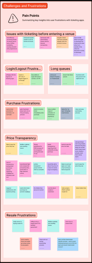
Pain Points
Seeks thrilling experiences, but gets frustrated by fees and hidden charges.
Feels uncertainty around resale processes, making her hesitate before committing to go out.
Has trouble accessing tickets at event entry due to poor venue Wi-Fi and time-consuming login steps.
Gets annoyed when events don’t match her vibe or expectations, leaving her feeling out of place.
SYNTHESIS
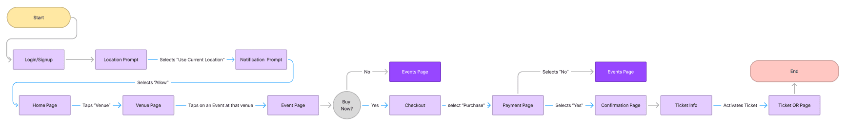
Task Flow
The next step was to integrate a detailed task flow of a potential scenarios a user might encounter while using Doors at 8.
IDEATION
Low Fidelity
After conceptualizing a design direction, I began crafting low to mid-fidelity wireframes to visualize my intentions for the design. This primarily focused on the onboarding process, group messaging, ticket resell and several other key features I aimed to incorporate.

FINAL DESIGN
High Fidelity
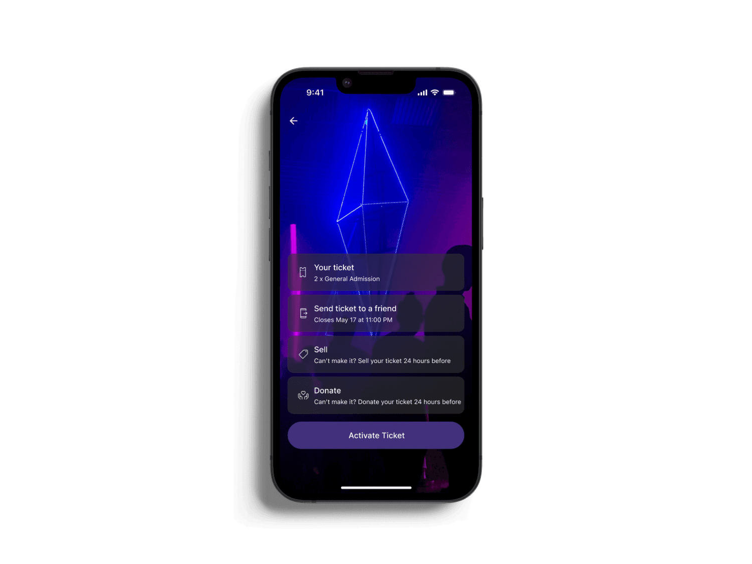
In the final design decisions, I focused primarily on enhancing the onboarding experience, streamlining the ticket purchasing flow, and improving group messaging. I introduced features not typically found in ticketing apps, such as detailed venue insights, including venue maps, key features (indoor/outdoor setting, venue capacity, available amenities) to empower users with essential event information.
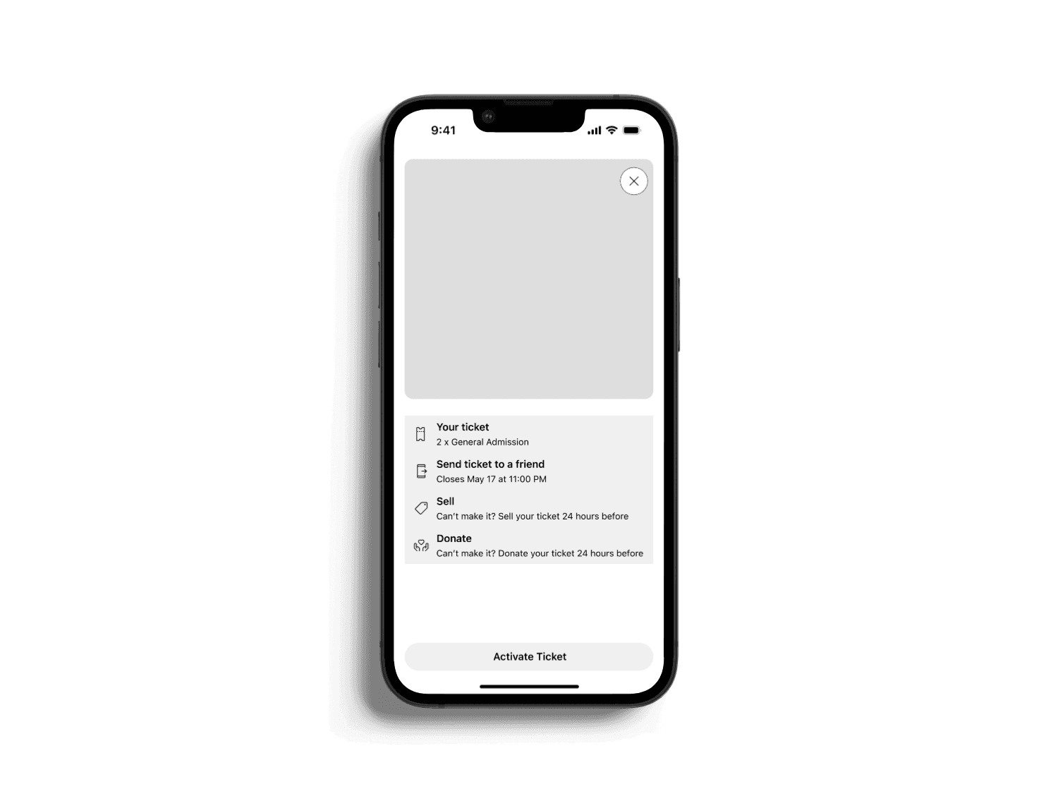
Additionally, I implemented a "Donate Ticket" function to reduce cognitive dissonance for users who want to offload tickets they're unable to sell. Finally, I integrated a downloadable ticket option, enabling users to access their tickets even without an internet connection.
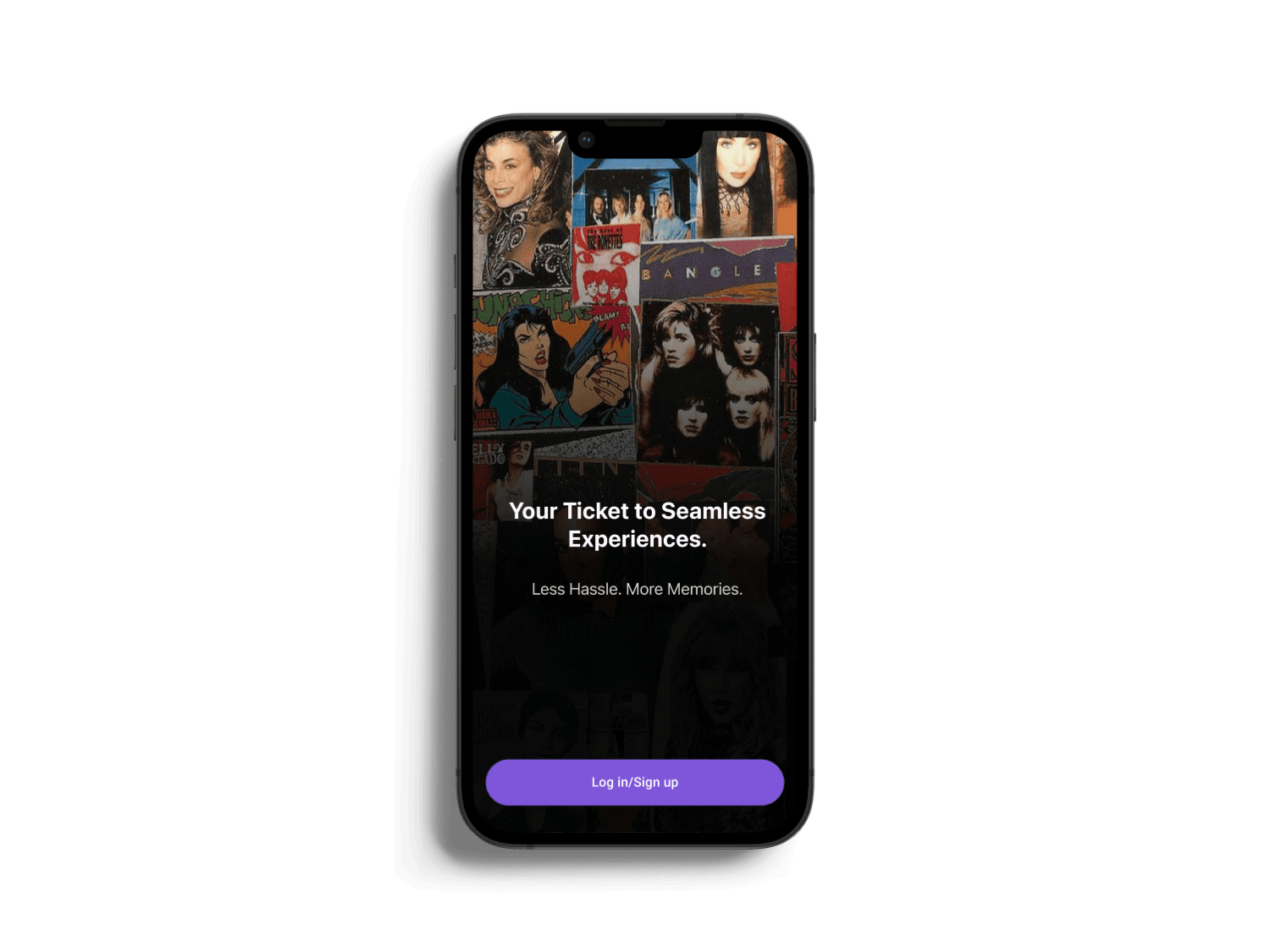
Onboarding
The research revealed that event-goers find lengthy login and signup processes frustrating. Many users also reported difficulty accessing their tickets promptly at events due to cumbersome sign-in procedures. To address this, we designed a streamlined, user-friendly single sign-in experience.
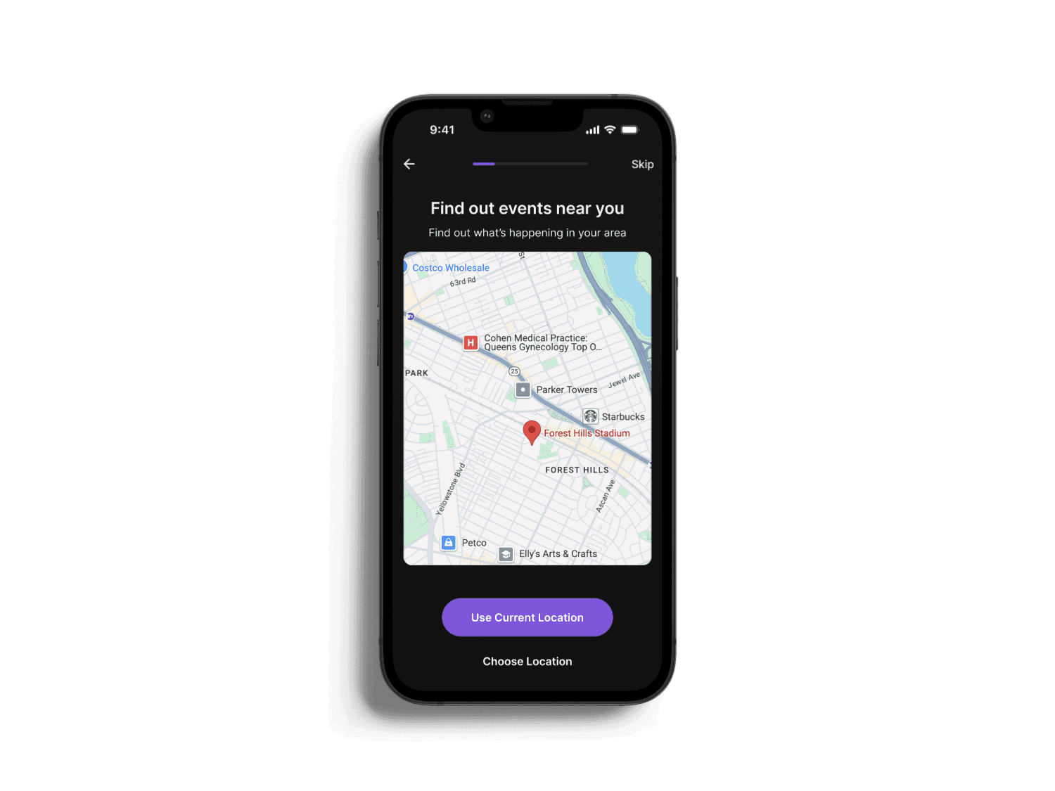
I enable users to personalize their app experience early on, such as configuring their location and notification preferences, but also provide a clear option to SKIP this step. This reduces cognitive load and simplifies the sign-in process for users who may be pressed for time.
Onboarding: Unhappy Path :(
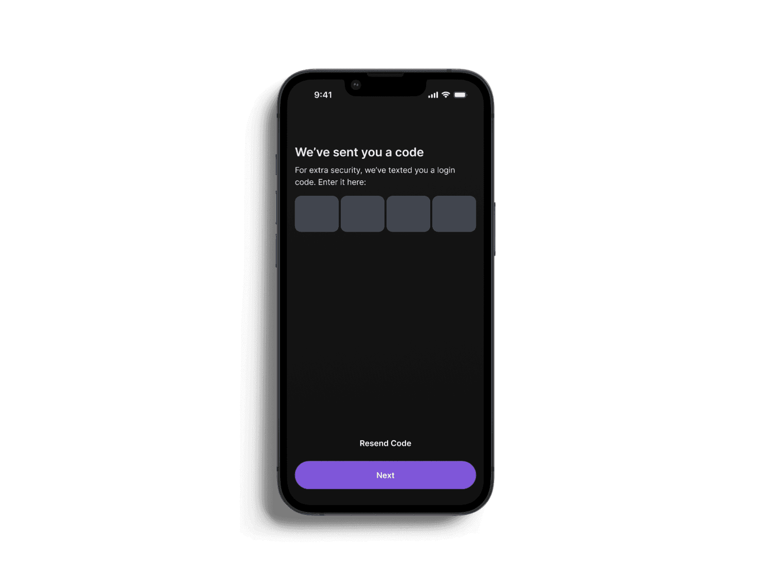
Although I designed a quick and simple sign-in process, I prioritized user account security by implementing a one-time verification code.


Onboarding: Happy Path :)
Once the correct code is entered, users can either continue customizing their settings or choose to SKIP this step and proceed directly into the app.


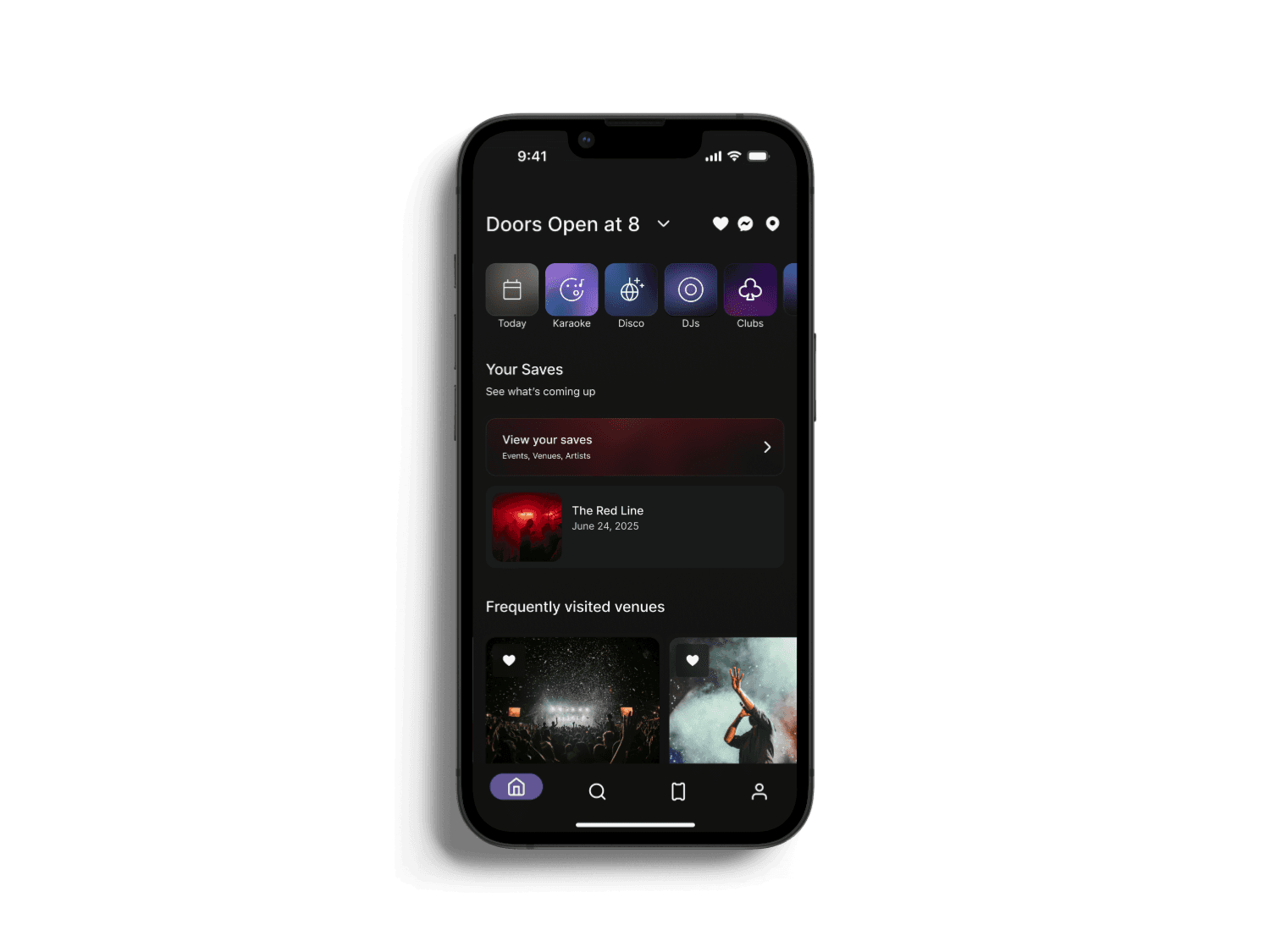
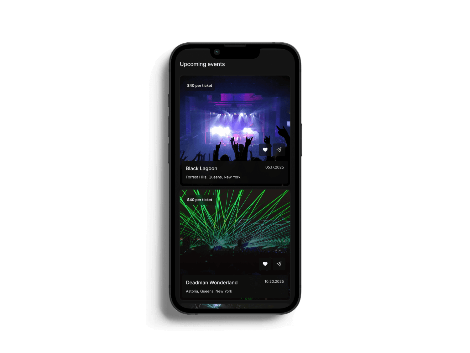
Homepage
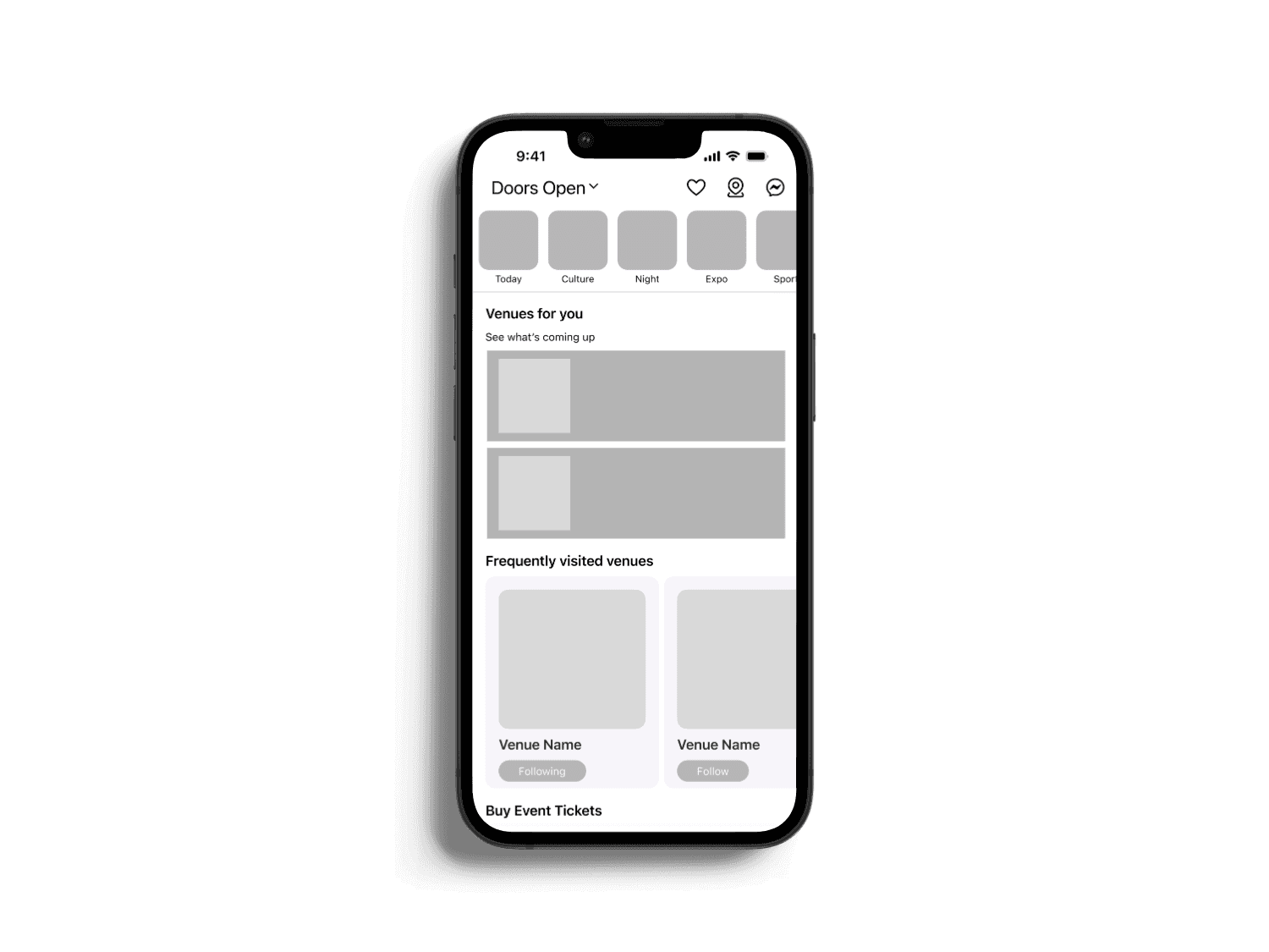
The homepage effectively engages users by clearly highlighting their saved events, frequently visited venues, and upcoming events through intuitive visual sections. By using vivid imagery and straightforward labeling, the layout effortlessly guides users to relevant content, reducing cognitive load. The incorporation of categories at the top (Today, Karaoke, Disco, etc.) promotes quick, personalized exploration. Additionally, the visually appealing dark mode reduces eye strain, enhancing readability and providing a comfortable browsing experience, particularly in low-light environments typical of event contexts.
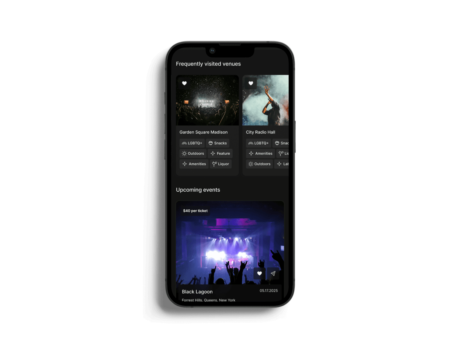
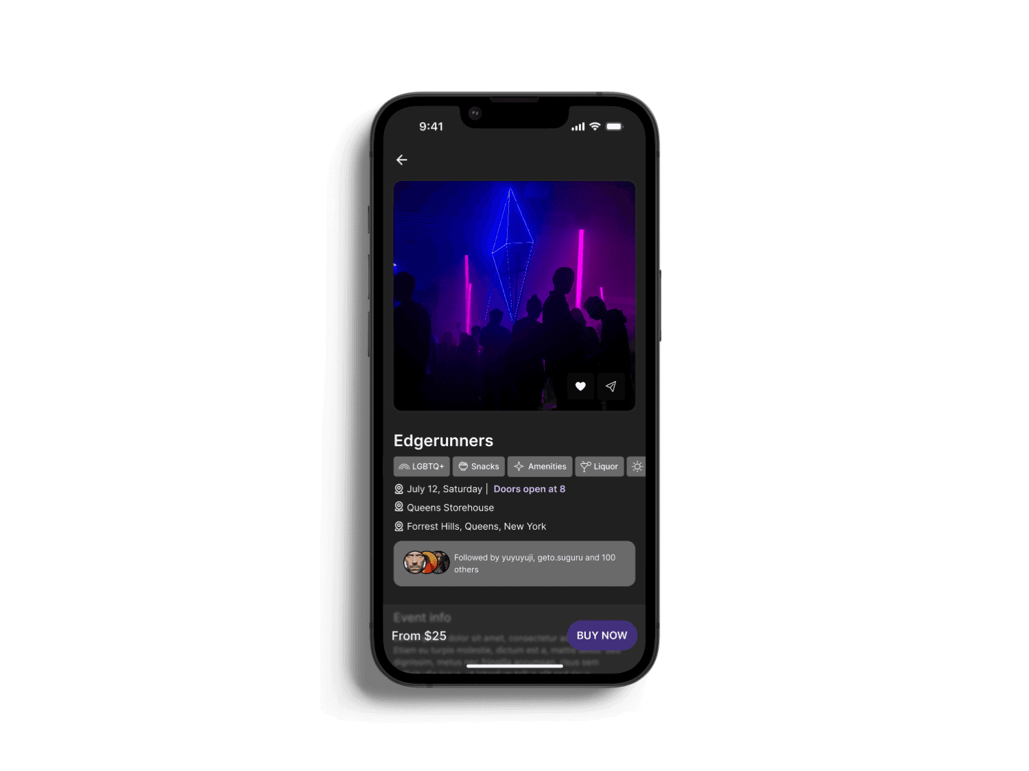
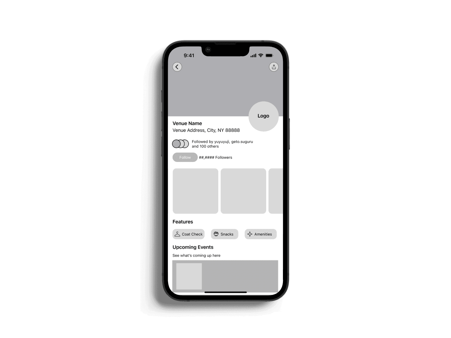
Ticket Purchasing Flow
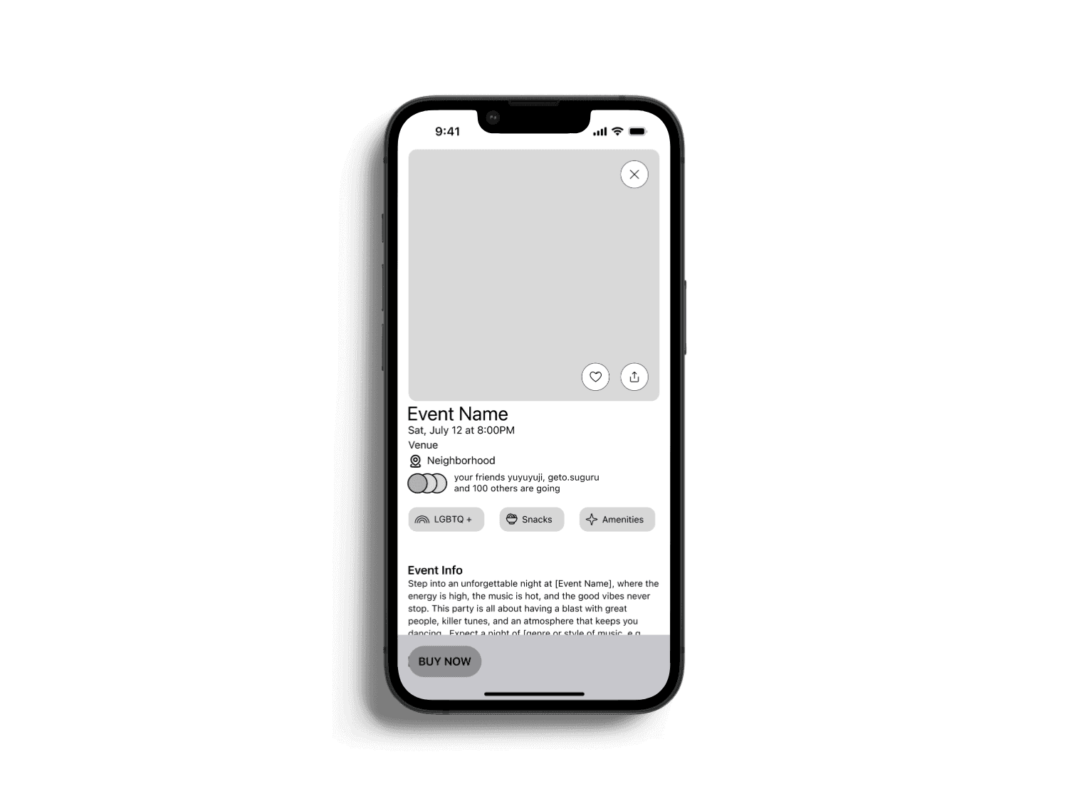
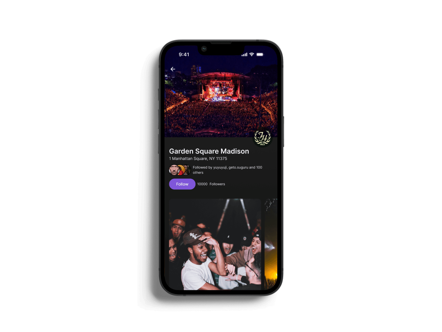
The ticket purchase flow thoughtfully prioritizes user needs and community values. Venue tags such as "Outdoor," "LGBTQ+," "Amenities," and "Snacks" effectively provide critical information at a glance, addressing users' desire to know what is available to them upon arrival. Additionally, the option to follow venues emphasizes community building by supporting local artists and smaller venues, aligning the app with user values. Recognizing user frustration with traditional ticket resale processes, we introduced a unique "Donate Ticket" feature, which significantly reduces emotional friction for users unable to attend or sell their tickets. Lastly, incorporating a scannable QR code along with downloadable and Apple Wallet integration ensures seamless ticket accessibility, even in situations with limited internet connectivity—a scenario frequently highlighted during our user interviews.


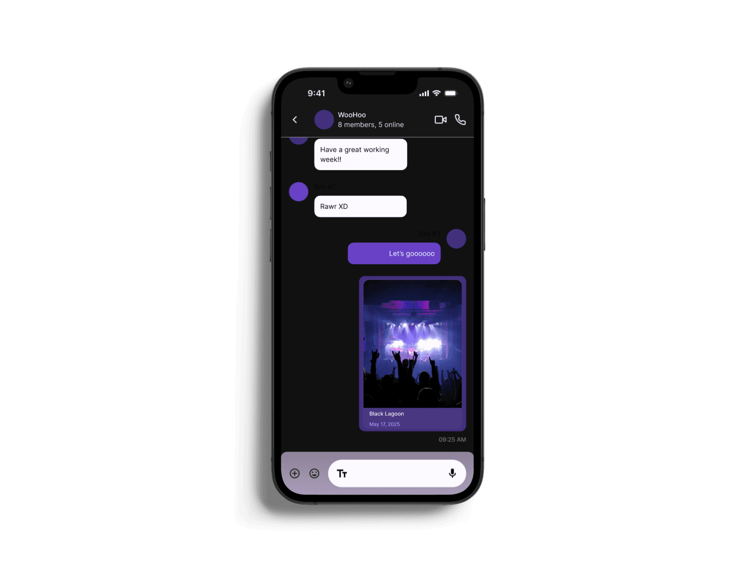
Group Messaging: Viewing Group Message
I decided to add in a group messaging experience, perfectly tailored for event-goers. It integrates effortlessly with the homepage, allowing users to swiftly transition from event browsing to active group discussions. Through my research, people typically share events through Instagram DMs as well as taking screenshots of the events on ticketing apps and sending it to group chats on Instagram and/or iMessage.
Users can now seamlessly share event details within the app itself instead of taking screenshots and sending it through another medium.
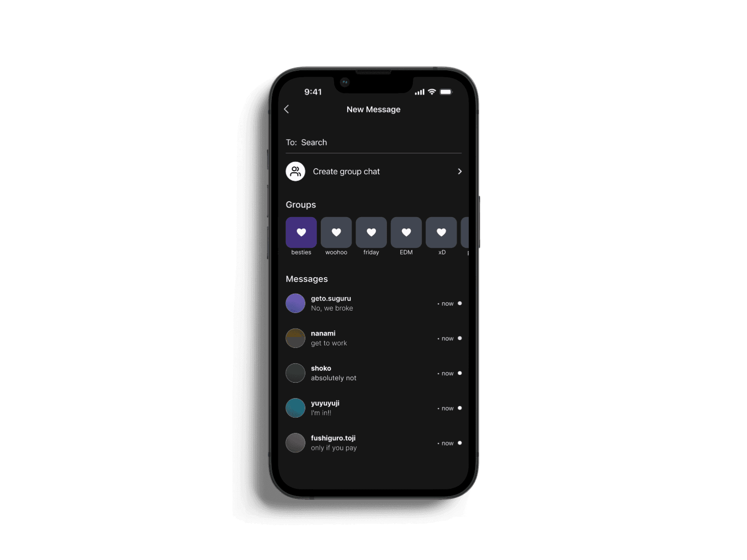

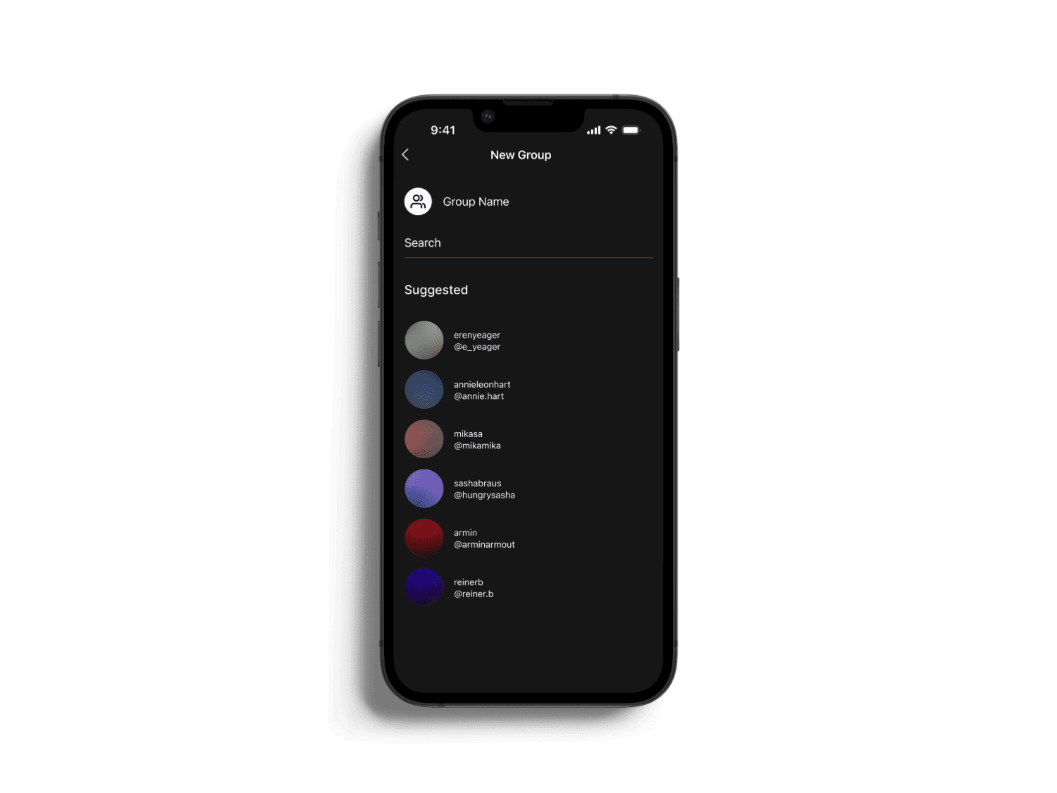
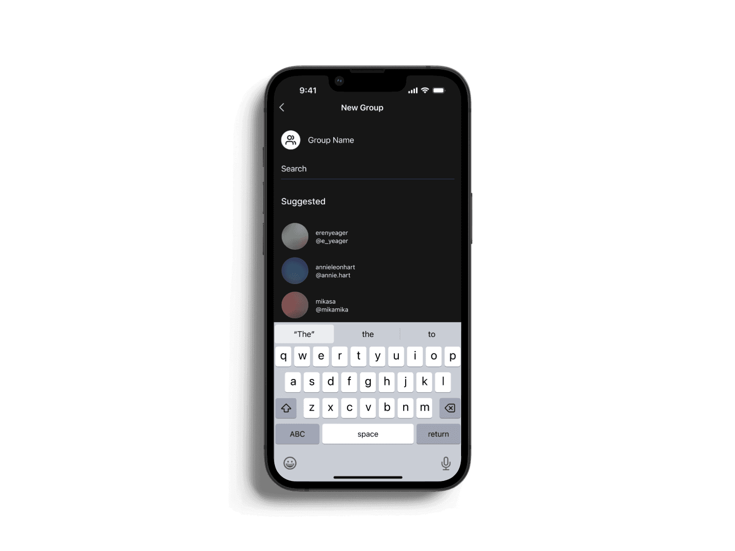
Group Messaging: Create New Group
Users also have the ability to easily create new group chats, empowers users to plan events, coordinate meetups, and stay connected with friends in a way that feels personal and dynamic.
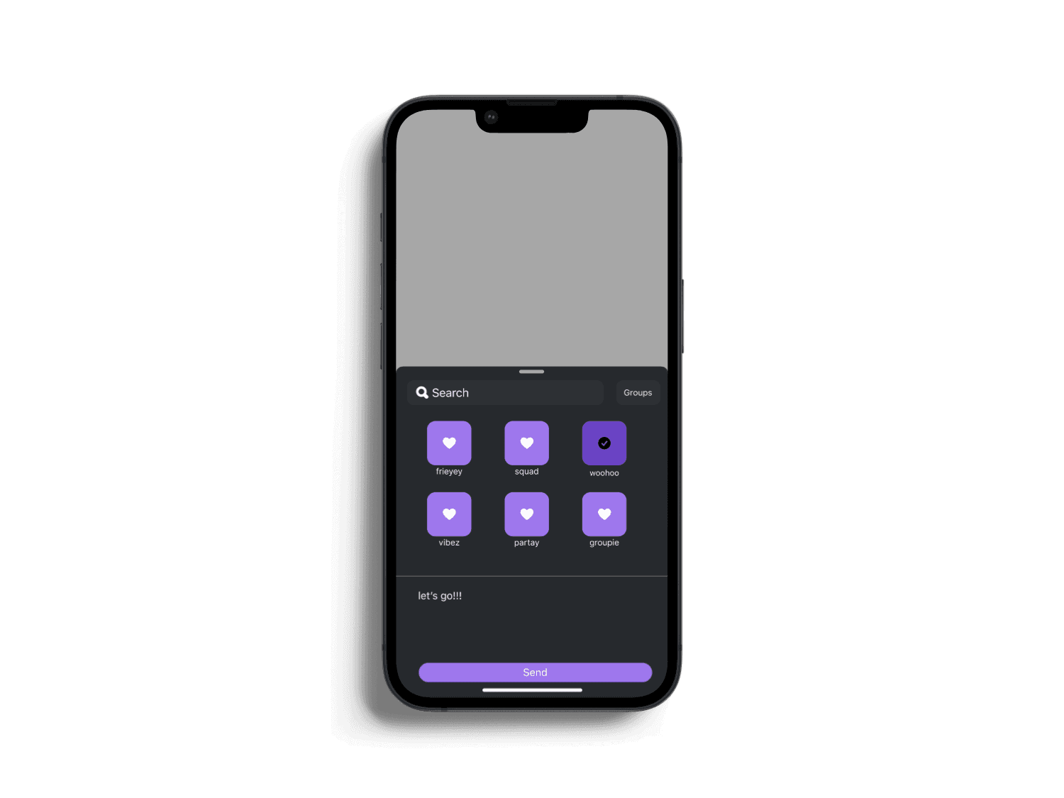
Group Messaging: Sending Event Information
Users can quickly send event details straight into their favorite group chats, making it effortless to coordinate plans with friends in just a few taps.


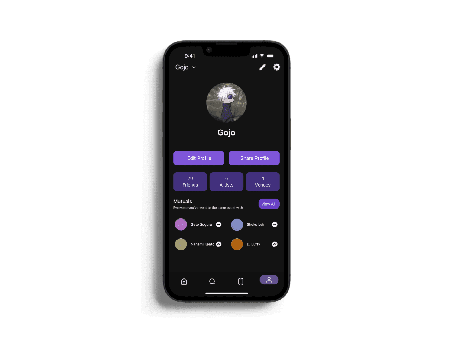
Navigation Bar
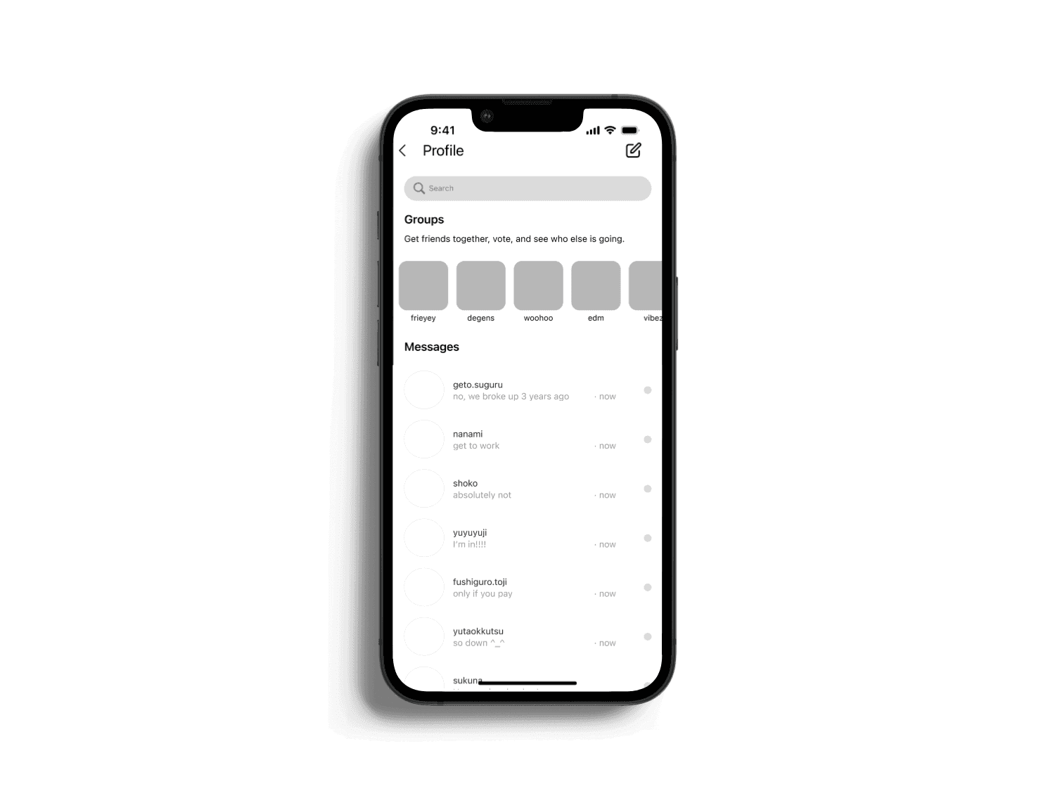
I designed the bottom navigation bar to give users quick and seamless access to the app’s core features. The Home tab leads to a personalized discovery feed featuring artists, venues, and events based on user interests. The Search tab allows users to explore trending events, apply filters, and browse by categories like raves, concerts, and costume parties. The Tickets tab provides instant access to purchased tickets, making it easy to retrieve QR codes for entry. Finally, the Profile tab lets users manage their account, view mutual connections, and share their event history—encouraging self-expression and social discovery.


Final Designs
High Fidelity Prototyping
The high-fidelity prototype for our ticketing app brings the full user experience to life, showcasing refined UI elements, intuitive navigation, and seamless ticket purchasing flows. Designed with community in mind, it includes features like venue profiles, group chats, and easy resale or donation options, making it effortless for users to discover, buy, and share tickets for local events.
REFLECTION
Conclusion
After completing this case study, I reflected on how much stronger I have become as a designer. I employed more technical techniques such as auto-layout, grids, and others, making my designs more consistent and structured. Additionally, I have grown as an interaction designer by practicing prototyping how users would realistically click certain buttons and anticipate their interactions. However, I believe the most significant growth for me was in my design thinking. I now approach design with a stronger focus on finding details for improvement and incorporating more UX thinking before diving into designs. I eagerly anticipate the next project I undertake!